Student Portal user interface
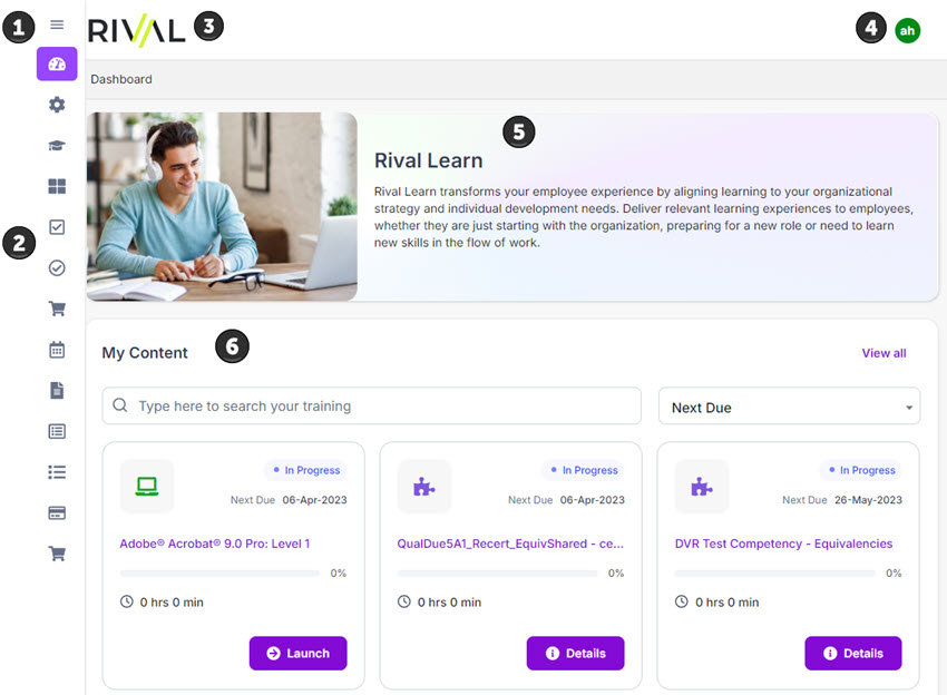
The Student Portal is a web-based software application, which means the user interface is made up of pages. Each page has a consistent look and similar navigational features. Each page is responsive, which provides an optimal viewing and interaction experience across a range of devices (mobile, laptop, and desktop). Review the main areas of the Student Portal below.
| Name | Description | |
|---|---|---|
| 1 | Hamburger menu | Toggle to expand or collapse the navigation bar. When collapsed, only icons are shown not text labels. |
| 2 | Navigation bar | Contains menu options to access pages to perform actions. |
| 3 | Header | Displays the Rival logo or a custom logo (if your administrator uploaded one). Tip: Click the logo on any Student Portal page to return to the dashboard. |
| 4 | User avatar | Avatar of the logged-in user's initials. If employee has a special character as first letter of first or last name, a generic image icon Tip: Click the thumbnail to see options to view/update your profile or log out. |
| 5 | Banner | (If enabled) Shows the name of your organization and text welcoming students to engage with content. The banner only appears on the dashboard. Note: Your system administrator can customize the title and text that appear here. Logo cannot be customized. |
| 6 | Content | Shows the training content assigned to the student. |
| Not shown in graphic | Learning Journeys | Shows a student's Learning Journeys. |
| Not shown in graphic | Popular Content | Shows the top 5 popular content to give a student a jumpstart on exploring learning content and finding content they might like to take. |
 is shown.
Breadcrumbs
With the exception of the dashboard, all other Student Portal pages have breadcrumbs:
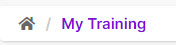
Breadcrumbs serve as a navigational aid so you can keep track of your location and maneuver easily.
Sorting
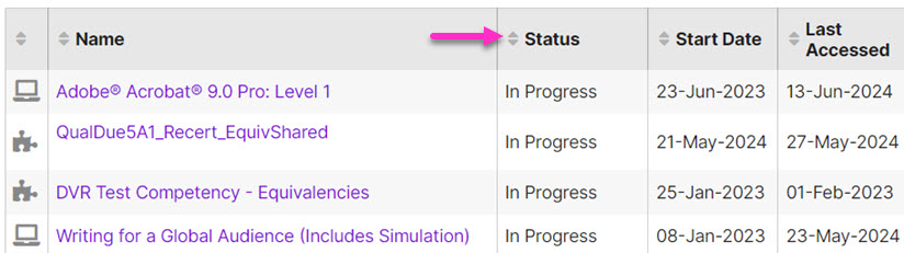
Data grids can be sorted by any column. Click a column heading to toggle the sort order between ascending and descending.