Form elements (in-depth)
Acknowledgment
This element requires the link it displays to be clicked prior to the Form being completed. The intent with this element is that a Form could be designed that requires an employee to open multiple policy documents and they can sign off on having received them on one Form.
If you are planning to host the documents you are linking to outside the system, they should be available without requiring authentication. The Form cannot determine if any authentication was successful when the link is clicked.
Edit mode
When the acknowledgment element is first dragged onto the Form,  indicates that the properties must be set. Click it or edit the properties to set the URL and link text (see below).

Once the properties are set, the acknowledgment element displays the link text.

Display mode
When displayed to the user, it is indicated as required. When designing your Form, use a static text field to explain you are expecting the employee to click on each document.

After the link is clicked, the document opens in a new window and there is a green check box next to the link text.

After the link is clicked, the date time is stored in the field, which can be retrieved with the Form data (GetFormXML). Date time format is YYYY-MM-DDTHH:MM:SS.sssZ. All times are stored in UTC (as indicated by the Z time zone).
Example: 2016-10-25T15:25:48.527Z
Properties
In addition to field name and help text, the acknowledgment includes the following properties:
| Property | Description |
|---|---|
| URL to view (required) | This is the path to the document. This path opens in a new browser window or tab.
|
| Link Text (required) | Text that is displayed to the user who is filling out the Form. The user clicks on any of this text to open the linked location. |
| Append to PDF | When checked, acknowledged PDF is added to the end of the printed or downloaded Form. Tip: This feature is only available for acknowledgment fields that contain pdfs; no other formats are included with the printed or downloaded document. |
| Date and time stamp | Date and time an acknowledgment link is initially checked. Turn it on by selecting (checking) the Show date and time viewed check box. |
Address Block – US and CA
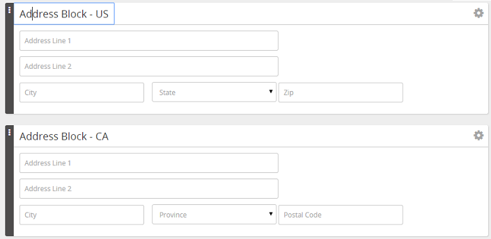
The Address block elements allow a United States or Canadian address to be presented in a familiar layout, which is not possible with individual text and selection fields. The difference between the US and Canadian blocks are:
- Field labels
- State vs Province
- Zip vs Postal
- Selection field values for states vs provinces
- The state selection field is populated from the FormBuilder_address_states list.
- The province selection field is populated from the FormBuilder_address_provinces list.
- Validation of Zip vs postal codes
Edit mode
The text on the address block elements can be edited by clicking the text and typing.
Display mode
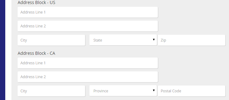
When displayed, it is indicated as required.
Properties
In addition to the field name and help text, the address blocks include the following properties:
| Property | Description |
|---|---|
| Required | This sets following fields to be required Address Line 1, City, State/Province, and Zip/Postal Code. |
| Default | Each of the fields within the block can have its default set individually. |
Banner
Every Form requires a banner. The banner contains Form title and a logo, which appears at the top of the page when the Form is displayed. The banner name defaults to the Form name. You can modify it without affecting the Form name.
Edit mode
You can edit banner text by clicking text and typing. You can use bold, italicize, underline, and change font size.

Display mode

Properties
| Property | Description |
|---|---|
| Field name | System-generated field name |
| Image | The path where the image is stored.
|
| Image Position | Controls where the logo is displayed. Options: Left, Center, Right. |
| Form Name Position | Controls where the form name is displayed. Options: Left, Center, Right. The image and name should not be in the same position |
Date Field
Date field element is used for collecting dates.
Edit mode
Edit the Date Field prompt by selecting text and typing.

Display mode
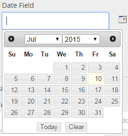
Date Field includes a calendar icon that opens a date picker.

Properties
In addition to the field name, required, date format, and help text the date field includes the following properties:
| Property | Description |
|---|---|
| Default | List of fields that can be used to default a date field are limited to date fields on the Employee Profile. |
| Validation | List of available validation functions are limited to the functions that recognize dates |
Electronic Signature
The element provides options for how employees can sign Forms. When included on a Form, an electronic signature is required before an employee can save and complete the Form.
Properties
In addition to the field name and date format, the electronic signature includes the following properties:
| Property | Description |
|---|---|
| Allow ‘wet’ signature | A wet signature is when an employee signs a paper form with a pen. This is what is traditionally considered a signature. To use this signature type, your employee needs access to a printer. Wet signature is selected by default. |
| Allow Cursor Sign | A cursor signature is when an employee uses the cursor and mouse to draw a signature on the page. This method captures an image of the employee signature, which is stored with the Form. |
| Allow Keyboard Sign | A keyboard signature is when an employee types in their name to sign the Form. |
| Allow PDF Sign Service | Uses a third-party signing solution for the electronic signature. Options:
Tip: If you select the Allow PDF Sign Service option, it is recommended that you do not select any of the other three signing options: wet signature, cursor sign, and keyboard sign. |
| Force Login when signing | Check to require a user signing the form to re-authenticate (or login) when initiating the signing process. (For clients using Rival Authentication.) |
| Check Validity on Reopen | Checks the validity of the employee's printed name when the task/Form is reopened. Example: When an employee completes a Form and enters their printed name, it is stored on the Form when, where, and how they signed it. If the employee's profile name changes (say from Mary Smith to Mary Smith-Jones), the employer may opt to reopen that task/Form to capture the name change. Upon reopening the task, the employee receives an alert and must re-sign the Form. |
| Keyboard Verification (required) | Select the name that you want to use to verify the electronic signature when an employee signs by typing in their name.
|
Footer
The footer contains information such as when the form was updated, internal identifier of forms printed, and so on. It appears at the bottom of each printed page.
Edit mode
Click footer text to edit it and type over the text.

Display mode
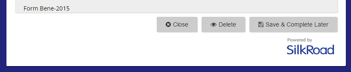
The footer appears above the buttons.
Properties
| Property | Description |
|---|---|
| Field name | System-generated field name |
| Form Name Position | Controls where the form name is displayed. Options: Left, Center, Right |
Full Name
This element allows a name to be horizontal, which is not possible with individual text fields. In addition to a field for first, middle, and last names, a salutation and suffix selection field can be added to the display.
Edit mode
Click text and type to edit the element.
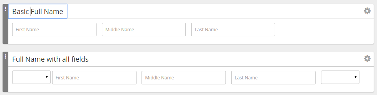
Display mode
The full name is required by default. Red bars appear beside required fields.

Properties
| Property | Description |
|---|---|
| Field name | System-generated field name |
| Required | Sets the first and last name fields to be required. (You cannot require the middle name, salutation or suffix.) |
| Show Salutation | When checked, salutation selection is displayed. Tip: The selection field is populated from the "FormBuilder_fullname_prefix" list. |
| Show Suffix | When checked, the suffix selection is displayed. Tip: The selection field is populated from the "FormBuilder_fullname_prefix" list. |
| Help Text | Help text to describe this element. |
| Default | The first, middle and last name in the Details section of an employee account is used to default the correct field of the full name. The only options for defaulting the full name field are:
|
| Encrypt | Encrypts the data when the Form is saved. Encryption translates data into another form, or code, so that the data is protected. |
Section
The selection element is used to visually breakup the Form and for controlling who can fill out the fields within it.
Edit mode
Edit text by clicking the text and typing. (Can do this on section title and body text.)
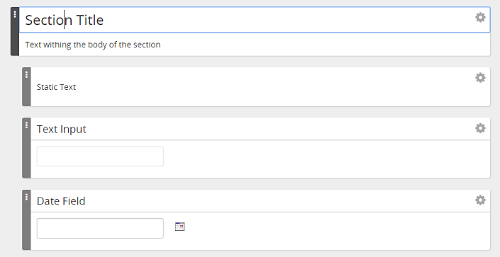
Editing fields within a section (indented) can be controlled by the properties of the section.
Display mode
Section title is in a light gray bar. All the fields within that section are indented to show they are part of that section.
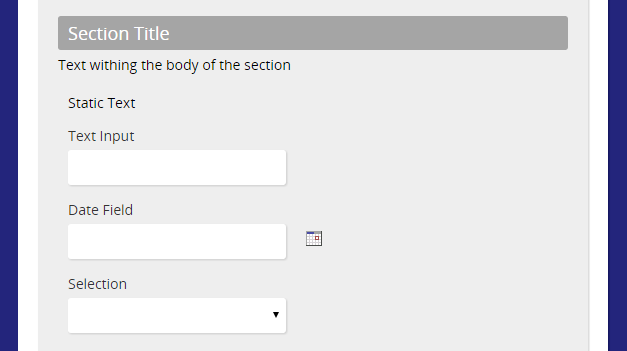
Properties
In addition to the field name, the section includes the following property:
| Property | Description |
|---|---|
| Permissions | Controls who can edit fields within that section on the Form. Options are:
|
Selection
The Selection field presents a limited set of values to be selected. Lists used for this element are managed from the Lists tab of the Forms Administration page.
Edit mode
When a selection field is first placed on the Form, no list is associated with it and one must be selected. You'll see this message:

Click  or edit properties to select the list.
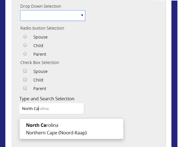
Once the properties have been set, the selection element displays the list in either a drop-down, radio buttons, or check boxes.
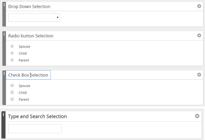
Display mode
When displayed, a user can pick from the selection list.
Properties
In addition to the field name, required, and help text, the selection includes the following properties:
| Property | Description |
|---|---|
| Option Type (required) | How options are presented:
|
| Value List (required) | List of values presented on the Form. Options in this list are managed from the Lists tab of the Forms Administration page. |
| Default | When using a default with a selection field, the value is only selected if it appears in the list that is being used for options of the selection field. For the most reliable pre-population of default values for a selection element, use the same list for the selection element and the source field for the default values. Example: A selection field for relationship includes options for spouse, child and parent. The field providing the default contains sibling. No value is selected when the Form is opened because the selection element list does not include sibling. |
Static Text
This element allows the entry of a large block of text that can be formatted for display on the Form. When you click within the element's text area, a tool bar appears with formatting options.
Edit mode
As text is entered, the element expands to accommodate the text that is entered.
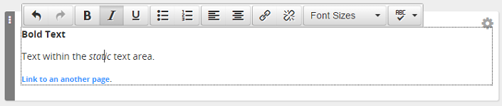
Text can be formatted using toolbar options. Links can be added/removed. Spell Check is available.
Text can be pasted from other applications; however, formatting that is not consistent with what is allowed in the editor may be removed.
Display mode

Properties
This element only has the field name property.
Text Input
This element is for collecting text input. It can be text or numerical data.
Edit mode
Edit by selecting text and typing.

Display mode

Properties
In addition to the field name, required, default, validation and help text, this field includes the following properties:
| Property | Description |
|---|---|
| Rows | Number of text rows allowed |
| Columns | Width of the text field (as it displays) |
| Max Length | Maximum number of characters allowed |
| Hidden | Controls if a field displays on the Form when an employee fills it out. A hidden field cannot be required or have validation. Example: A hidden field is useful when it is defaulted with an employee identifier like Employee ID or SSO ID. Field is delivered with the Form data to an integration that collects the data. |
| Read Only | Cannot be edited by any user who opens the Form no matter the permissions of the section that the field appears in. Sections that are set as read only prevent any user who opens the Form from editing any of the fields in that section. |
| Place Holder Text | Place holder text displays in light gray until user enters text. |
| Input Mask | Controls of format of text entered into the field as text is typed. Can also be used to restrict the types of characters that can be entered. |