Self-Service Advanced Analytics
Introduction
Advanced Analytics opens the door to how all aspects of Workflow are running. Users with Advanced Analytic access will be able to see standard dashboards related to events, insights, tasks, teams and users. Analytic users will also have permissioned access to build and schedule custom dashboards and reports.
Administration Settings
Rival Workflow has two new pages dedicated to analytics: Advanced Analytics and Custom Dashboards. If you do not have Advanced Analytics enabled on your site, please reach out to your Rival CSM or support@rival-hr.com on steps to add relevant users for each tier.
Team Privileges
As part of the initial release, Rival is offering three tiers of access to Advanced Analytics which will ensure that users have the relevant views and access they need in order to review insights or create their own dashboards. Please reach out to your Rival CSM or support@rival-hr.com on steps to add relevant users for each tier.
Tier 1 – Basic
The Basic reporting privilege grants teams the ability to view dashboards only. This is the lowest tier of permissions.
- Access Data
- Download
- See Dashboards
- See Looks
Tier 2 – Standard
The Standard tier privilege grants all Basic functions in addition to building their own reports in Customer Dashboard, save content and view user dashboards. This is the middle tier of permissions.
All of Tier 1 privileges plus...
- Can create Forecast
- Clear Cache Refresh
- Create Table Calculations
- Embed Browse Spaces
- Embed Save Shared Space
- Explore
- Save Content
- See Drill Overlay
- See User Dashboards
Tier 3 – Premium
The Premium tier privilege grants all Basic and Standard functions in addition to custom reporting options and automated report scheduling distribution. This is the highest tier of permissions.
All of Tier 1 and 2 privileges plus...
- Create Alerts
- Schedule External Look Emails
- Schedule Look Emails
- Send Outgoing webhook
- Send to Integration
- Send to S3
- Send to SFTP
Advanced Analytics
Introduction
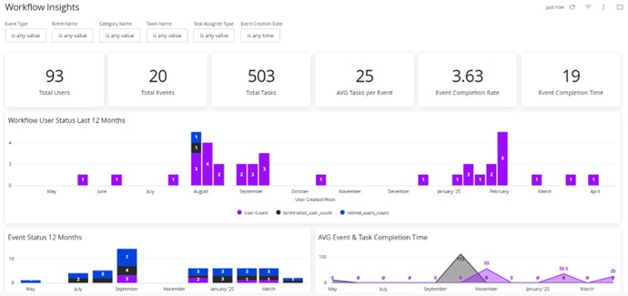
Welcome to Advanced Analytics: a collection of multiple visualizations organized together to provide a comprehensive overview of data. Here, you have the power to create the most ideal visualization that fits your business needs. Adjust the page filters, build additional dashboards, schedule automated reporting, and more.
Feature Definitions
Filters
Filter components are pre-built pieces of the application that can provide filter functionality for standard and customized dashboards. Each dashboard has its own standard filters. With filters, you can target specific data points to track progress for desired locations, departments, timeframes, and more! Any filter can be mixed and matched to pick your own path of data insights. Users with Tier 2 or Tier 3 access can create copies of standard dashboards with different filters.

Smart Tiles
Tiles are visualizations that are predetermined statics for meaningful data insights. Smart Tiles can be query-based for enhanced visualization. Smart Tiles provide the most meaningful quick statistics at first glance. By default, values are shown from the past 365 days. Smart Tiles respect the filters, so date ranges can be adjusted as needed. All filters directly drive the Smart Tile results.

Smart Tile actions allow the permissioned user to drill deeper into the displayed data.
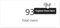
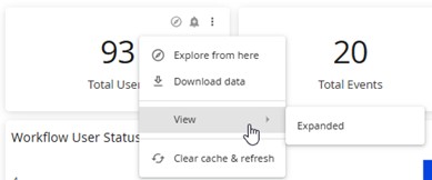
With each step further into your company’s data, efficient processing and bottlenecks can be identified easily. Tile actions are permission based. See Team Privileges for more details on which permissions will suit your users best.
Smart Visuals
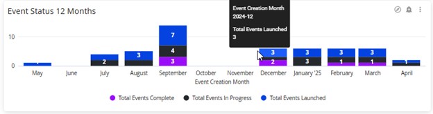
Smart Visuals are a saved data visualization containing specific filters, charts, and/or formatting choices. With Smart Visuals, you will have a quick, eye-catching view of the current business activities in the database.
Smart Tables
Smart Tables are a tabular representation of the of Smart Tiles. Tables can be query-based or linked to Smart Tiles. Smart Tables provide an additional layer of insights from Visualizations. You can download it, and access that particular data directly within the dashboard by clicking on the Smart Table. This allows you to save the data into a larger dashboard for easier access and context.
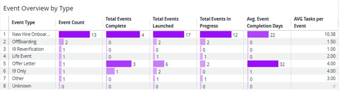
Custom Dashboards
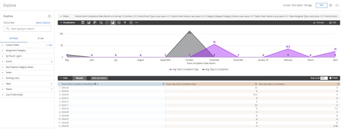
Custom Dashboards, also referred to as Explore, allows users to create their own dashboards, reports and visualization. By selecting fields from the field list users can define their own filter sets, sort order, pivot table and desire type of visualization.
Fields
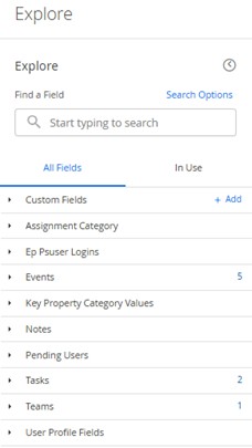
Fields in Custom Dashboards are categorized data points where you can select anything from names, locations, events, teams, tasks and more! You can select any field from your desired topic(s) to add to the data results or as a filtered item. This allows you to create your own custom dashboard and/or report. The numbers to the right of the section represent how many fields from that section are currently in use for the custom dashboard.
Filters
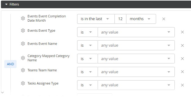
Filters allow you to drill down into the details and select a value/s to better segment the specific results you’re trying to create. Like the Dashboard filters, you can determine the outcome of your data based on specific data points.
Visualizations
A Visualization is a graphical representation to visualize and analyze organizational data. Adjust how you want to see your data. Make a bar graph, pie chart, funnel or multiple other cool visual aspects of data.
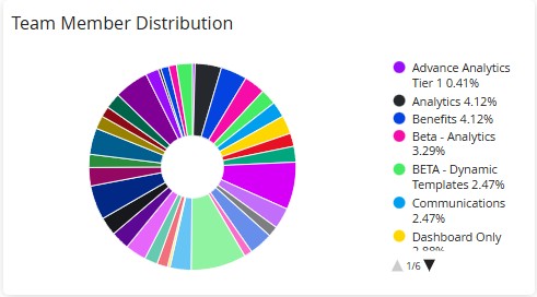
Data
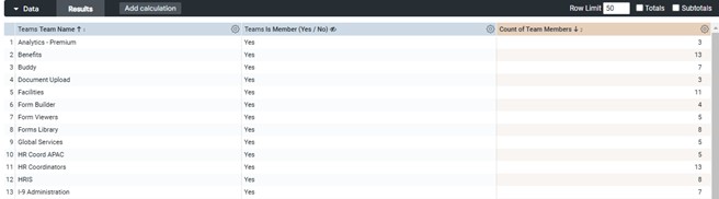
The data view shows the result of selected filters in a Smart Table or Custom Dashboard. Having powerful data to represent your business performance allows you to mold the desired visualizations. You can create your own reports providing tangible data on the success and opportunity area with your workflow journeys.
Custom Dashboard Directions
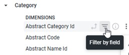
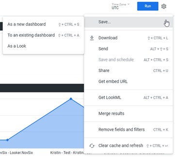
Add, remove, update fields to the filter section by selecting the “Filter by field” option or from the Options wheel in the Data area.
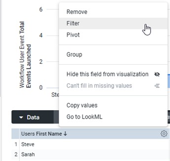
Add as many columns of data as needed to create custom dashboards or reports for events, users, tasks, teams and more. Combine all of the information together or create and save separate reports for specific users. Leverage the Tier 3 privilege to do all the fun things within Custom Dashboards!
Glossary
For additional information on terms used in the Advanced Analytics dashboards, please see the Glossary.
Dashboard: A collection of multiple datasets organized together to provide a comprehensive overview of data.
Look (n.) : A Look is a single query table or visualization that is saved. Looks can be added to dashboards, scheduled, shared, and made public. Any changes made to a Look will be reflected in any dashboards that contain it.