Analytics Library and Custom Analytics
Overview
Learn Advanced Analytics is the backbone of the learning admin experience. It gives teams real-time, no-code reporting that removes the hassle of pulling key insights. Users with Advanced Analytic access will be able to see pre-defined dashboards in the Analytics Library related to Learner activities and achievements, Content engagement, and Learning Journey progress. Analytic users will also have permissioned access to build and schedule custom dashboards and reports.
Key Capabilities
- Pre-Built Dashboards: Get immediate visibility into learner activity, achievements, content engagement, and journey progress—no setup needed.
- Custom Dashboards & Reports: Build reports tailored to business needs in just a few clicks, no complex setup required.
- Visual Analytics & Smart Tiles: Spot trends and track performance instantly with interactive, easy to read visualizations.
- Scheduled & Automated Reports: Keep leaders and key stakeholders informed with data updates delivered on-schedule.
- Real-Time Data Access: Instant access to real-time data allows for faster decision making with current, accurate insights.
- Advanced Filters & Drill-Downs: Focus on the most relevant and most specific data set with easy-to-use filters.
- Data Exports & Sharing: Download reports or share insights with teams for better collaboration.
Getting Access
To access Learn Advanced Analytics, users must be assigned to an Advanced Analytics Workgroup. Workgroups determine what data users can access, and permissions are defined by both Workgroup Type and Access Tier. Admins can manage Workgroups in the Admin Portal:
Enterprise > Admin> Workgroups > search "Advanced Analytics Workgroups"
There are two Workgroup types (Admin, Instructor) and three tiers of access (Basic, Advanced, Premium). The workgroup type and access tier are defined when the Workgroup is created.
Tip: Assign Admins to the Premium Workgroup to ensure full access to all analytics features. For Instructors, Basic access is usually sufficient.
Note: If a user belongs to multiple teams or instances, they’ll receive the highest access level granted.
Access Tiers
Rival offers three tiers of access to Learn Analytics to ensure users have the appropriate reporting tools and permissions
- Basic: View dashboards and download data
- Advanced: Includes Basic + custom dashboards, data exploration, saved content
- Premium: Includes Advanced + scheduled reports and advanced delivery options
| Tier 1 - Basic | Tier 2- Advanced | Tier 3 - Premium | |
| Access and Download Data | X | X | X |
| See Dashboards | X | X | X |
| See Looks | X | X | X |
| Create Forecast | X | X | |
| Clear Cache Refresh | X | X | |
| Create Table Calculations | X | X | |
| Embed Browse Spaces | X | X | |
| Embed Saved, Shared Spaces | X | X | |
| Explore – Advanced Analytics | X | X | |
| Save Content | X | X | |
| See Drill Overlays | X | X | |
| See User Dashboards | X | X | |
| Create Alerts | X | ||
| Schedule External Look Emails | X | ||
| Schedule Look Emails | X | ||
| Send Outgoing Webhooks | X | ||
| Send Data to Integrations | X | ||
| Send Data to S3 | X | ||
| Send Data to SFTP | X |
Workgroup Limits
Each Advanced Analytics Workgroup has user limits:
- Basic: up to 8 users
- Advanced: up to 3 users
- Premium: up to 3 users
Your Analytics Toolkit
Filters
Filter components are pre-built pieces that provide filter functionality for standard and customized dashboards. Each dashboard has its own standard filters.
With filters, you can target specific data points to track progress! Any filter can be mixed and matched to pick your own path of data insights. Users with Tier 2 or Tier 3 access can create copies of standard dashboards with different filters.
Smart Tiles
Tiles are visualizations based on pre-determined metrics that surface meaningful data insights. Smart Tiles can be query-based for enhanced visualization.
Smart Tiles provide the most meaningful quick statistics at first glance. By default, values are shown for the past 180 days. Smart Tiles respect the filters, so date ranges can be adjusted as needed. All filters directly drive the Smart Tile results.
Smart Tile Actions
Smart Tile actions let permissioned users explore data in more detail. Hover over a tile or use the “More Options” menu to drill in, download the data, or build a custom visualization based on what’s displayed. Tile actions are permission based.
Smart Visuals
Smart Visuals are saved data visualizations containing specific filters, charts, and/or formatting choices.
With Smart Visuals, you will have a quick, eye-catching view of the current business activities in the database.
Smart Tables
Smart Tables show the data behind Smart Tiles in a table format. They can be query-based or linked directly to Smart Tiles. Clicking a Smart Table lets you explore the data in detail right from the dashboard. You can also download the table or add it to a larger dashboard for easier access and context.
Feature descriptions by Tier
Available to Advanced & Premium Users (Tiers 2-3)
- Create Forecasts – In a line chart, open Visualization settings > enable Forecast to project trends.
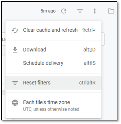
- Clear Cache & Refresh – On any dashboard/Explore view, click three dot icon > Clear Cache & Refresh to pull fresh data.
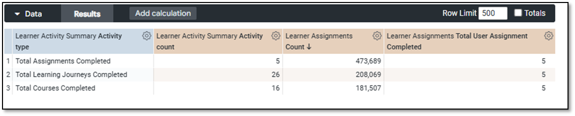
- Table Calculations – After running a query, click the gear next to a column > Add Table Calculation, enter a formula (e.g., ${completed} / ${assigned}), and save.
- Embed Browse Spaces – In Browse panel, click the gear > Embed to copy a shareable folder URL or embed code.
- Embed Saved/Shared Spaces – On a Look or dashboard, use the gear > Embed URL to share externally or embed in other platforms.
- Explore – Advanced Analytics – Choose a data source, add fields, apply filters, pick a visualization, and click Run.
- Save Content – Click the gear > Save As to store your dashboard or Look in a shared or personal folder.
- See Drill Overlays – Click any metric in a chart to view row-level data behind the visualization.
- See User Dashboards – Access others’ dashboards via Browse > Shared/User Spaces; favorite or duplicate if needed.
Premium-only Capabilities (Tier 3)
- Create Alerts – Hover over a dashboard tile, click the bell, set a condition (e.g., score > 90%), choose delivery, and save.
- Schedule External Look Emails – On any Look/dashboard, click the gear > Schedule Delivery > add external emails, format, and frequency.
- Schedule Look Emails (Internal) – Use the gear > Schedule Delivery to set up internal distribution and timing.
Tip: Schedule a one-time send to test delivery. Avoid Test Now—it's meant for backend validation.
- Send Outgoing Webhooks – Under Advanced Options in scheduling, choose Webhook, and enter URL + headers.
- Send to Integrations – Deliver scheduled reports to Slack, Teams, or CRM from Advanced Options.
- Send to Amazon S3 – Choose Amazon S3 as a delivery method and enter bucket, path, and access credentials.
- Send to SFTP – Choose SFTP, then configure host, port, login, and file destination path.
Tips & Best Practices
- Start with the pre-defined dashboards to get a feel for the available data and structure.
- Use filters to drill down and answer specific questions—by team, date, content type, and more.
- Schedule recurring reports to keep managers informed without manual effort.
- Download visuals to include in presentations, reports, or compliance documentation.
- Name and organize custom dashboards clearly so others can find and use them.
- Keep filters consistent when comparing data across reports to ensure accuracy.
- Preview your visualizations before saving to make sure the chart type fits the data.
Analytics Library (prev. Pre-Defined Dashboards)
Under Reporting & Analytics > Pre-defined Dashboards, select the dashboard from the drop-down on the right.
Four dashboards have been pre-defined to support Admin needs.
- Learning Activity
- Learning Achievement
- Content Engagement
- Learning Journey Engagement
The More Options menu allows you to refresh data, download, schedule delivery, or reset filters.
Learning Activity Dashboard
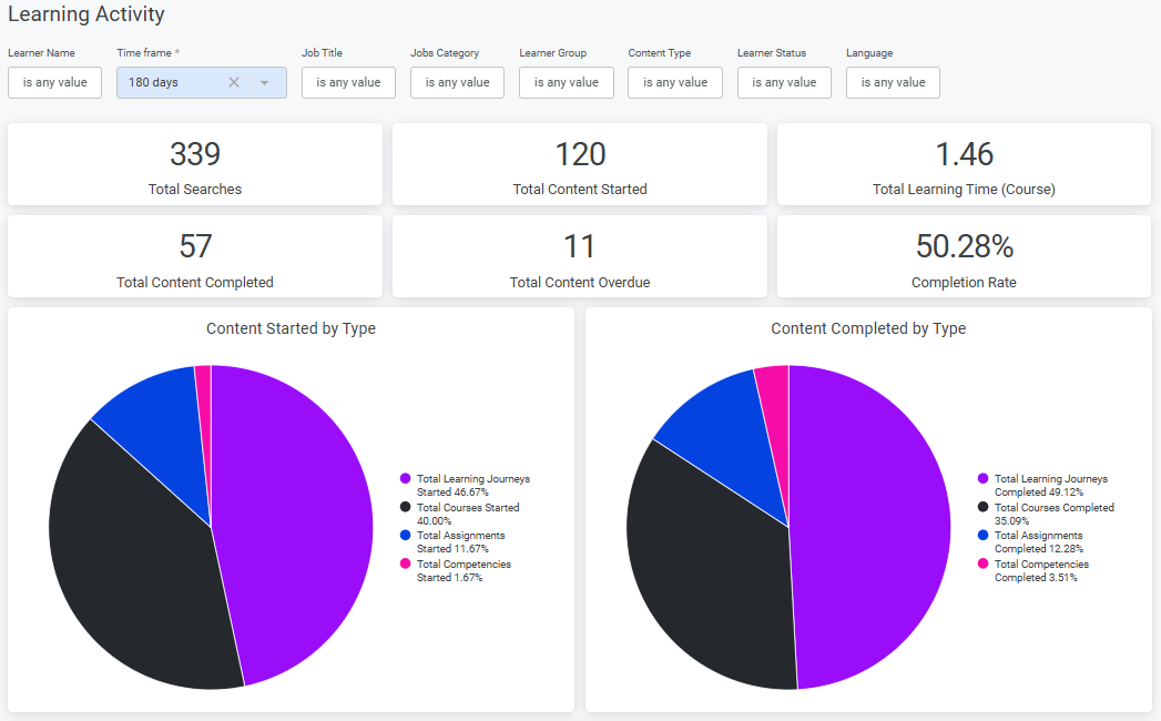
This dashboard provides admins with an organization-wide view of learner activity and engagement. It tracks overall learning behavior—not tied to specific courses—but aggregated across roles, groups, and categories.
Key metrics include searches, content started, time spent, completions, and overdue activities. The dashboard breaks down these metrics by job role, learning group, category, and individual learner, offering granular insights into engagement patterns.
Designed for broad visibility, it helps admins and managers identify trends, spot high performers, and monitor learning progress to align training efforts with organizational goals.
Learning Achievement Dashboard
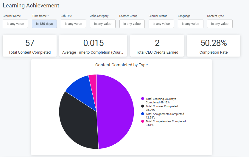
This dashboard is purpose-built for tracking mandatory learning across the organization, such as certifications and compliance training where completion is critical. It provides detailed insight into completion status, rates, and trends.
It shows who completed which courses and when, helping admins monitor progress against regulatory and organizational requirements.
By focusing on completion rates, credits earned, and individual progress, it supports reporting, audits, and identification of compliance gaps—zeroing in on measurable outcomes rather than broader engagement.
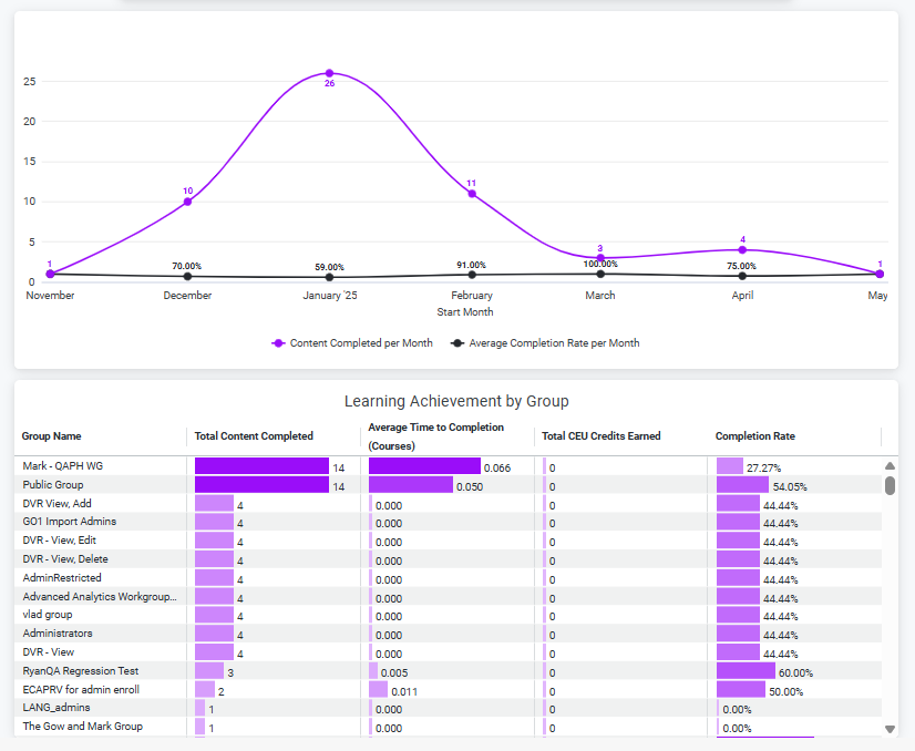
Content Engagement Dashboard
The Content Engagement Dashboard helps learning admins and content creators understand how learners interact with individual content assets across programs—revealing what’s resonating, what’s effective, and where learners may be getting stuck. This dashboard is key to identifying gaps in content performance and learner needs within larger learning journeys.
For admins, it offers a view into the full content lifecycle, from launch to completion, highlighting how content supports key goals like compliance, empowerment, and skill development.
For creators, it measures average time spent, completion trends, and potential blockers—making it easier to optimize content for clarity, engagement, and impact.
Learning Journey Engagement Dashboard
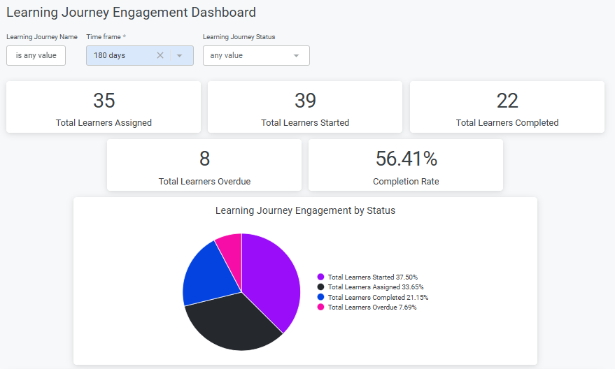
A dashboard that reflects the engagement level of admin learning journeys assigned to learners, so admins can understand how learners are interacting with them and work with team managers to align content in learning journeys with skill development needs.
This dashboard tracks learner progress through structured learning journeys—the only asset type with defined objectives, requirements, and grouped content. It helps learning admins and team managers monitor adoption, engagement, and risk across teams and regions.
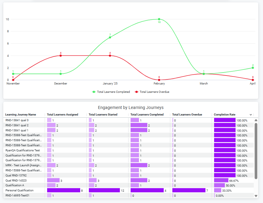
Admins see key learner-based metrics: number of learners assigned, learners who have started, completed, or are overdue. A visual compares learners completed versus overdue over time, while a table breaks down these metrics by learning journey (fka qualification), providing a clear view of progress at a glance.
These insights help admins assess the effectiveness of learning journeys, ensure timely completions, and identify teams or regions where additional support may be needed.
Advanced Analytics
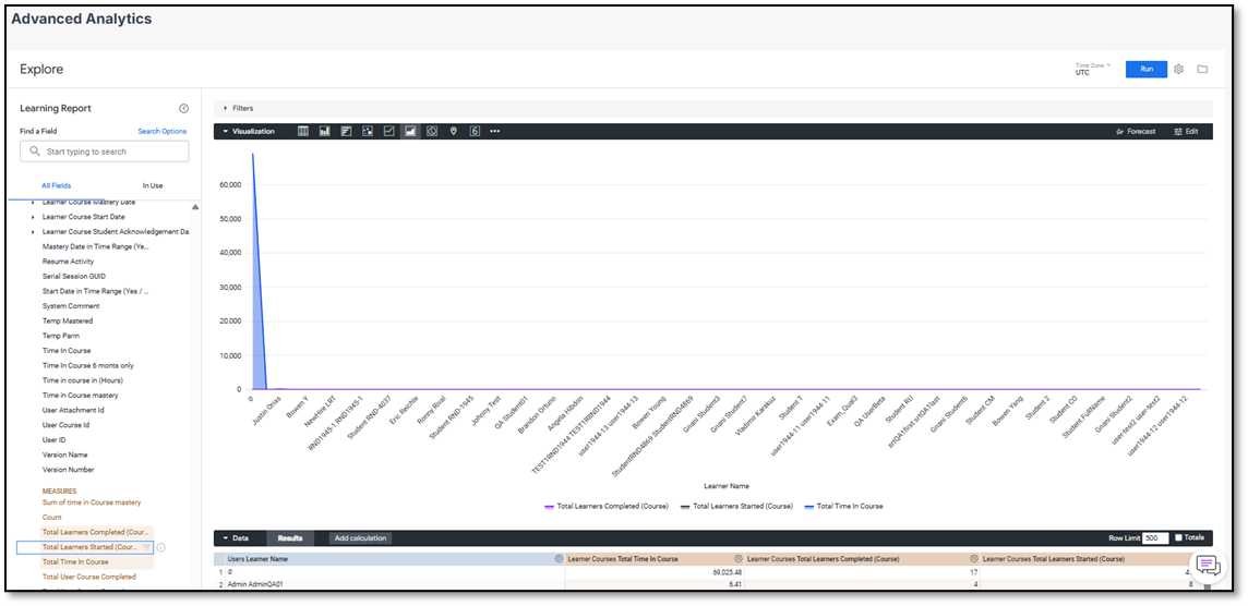
Advanced Analytics, also known as Explore, gives Learning Admins the ability to build their own custom dashboards and reports beyond the four pre-defined dashboards. Access is limited to Advanced and Premium users.
Using Explore, Admins can:
- Choose data fields (such as learners, learning journeys, completions, content, etc.)
- Apply filters to narrow down results
- Sort or pivot the data
- Select the visualization format that best represents the insights they need (e.g., bar chart, line graph, table)
- Save or share your custom views for repeated use
This flexibility allows Admins to tailor reports to their specific needs, such as monitoring overdue assignments in a particular department, comparing content engagement across regions, or tracking certification completion by role.
To build a report:
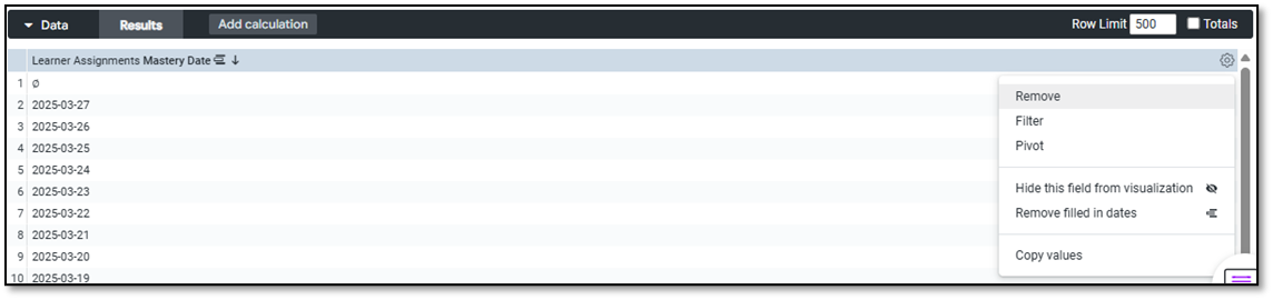
- Use the "Filter by field" option or the gear icon in the Data section to add or update filters.
- Add as many columns or data points as needed to explore events, users, tasks, teams, and more.
- Combine results into a single dashboard or save targeted Looks for specific users or use cases.
To build a Custom Report in Explore:
- Go to Reporting & Analytics > Explore from the Admin Portal.
- Select fields to include in your report (e.g. Learner Name, Course Title, Completion Date).
- Add filters to focus your results (e.g. by Team, Content, Date Range).
- Choose a visualization type (table, bar chart, etc.).
- Click Run to generate your results.
- Use the Data Table below to review or export details.
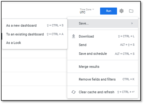
- Click Save to reuse or add the report to a dashboard.
Fields
Fields represent the specific data points available in the LMS (e.g., learner name, content title, completion status, assigned date). You can select fields to include in your results or use them as filters.
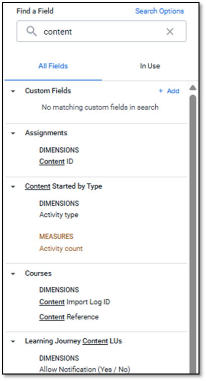
There are four major types of fields:
- User – Data about individual users: name, job title, location, login history, etc.
- Content – Data about courses, exams, learning journeys, competencies, and other assigned materials.
- User-Content Activity – Data about learner progress: completions, scores, CEUs, assignment status, and more.
- Organization – Information about your org’s structure: categories, cost centers, classrooms, and certification types.
Use the search bar or the "In Use" toggle to find and manage the fields you’ve selected. The number next to each category shows how many fields are currently in use.
Filters
Filters help you focus on specific slices of data—like only showing results for a certain team, date range, or content type. These work just like filters in the pre-defined dashboards, but with more customization.
Use the gear icon in the Data section or the Filter by field button to add filters.
Visualizations
After selecting your data and clicking ‘Run’, you can choose how to display it—bar charts, tables, pie charts, and more. Choose the format that best surfaces the insight you're looking for, whether it’s a performance trend or a content drop-off.

Data Table
At the bottom of the Explore view, you’ll see a table showing the raw data behind your selections. This lets you validate what’s powering your visualizations or export detailed data for further analysis.