Checklist Authoring page
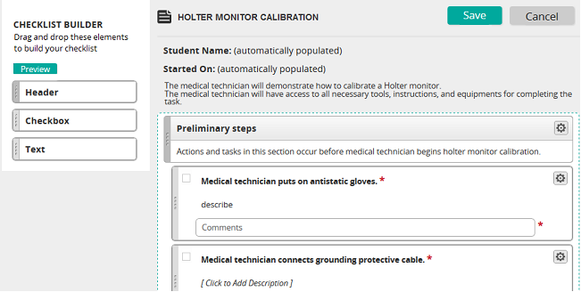
On the Checklist Authoring page, you select the elements (content) to include on a checklist. This page has two primary sections:
- Checklist Builder panel
- Content panel
Checklist Builder panel
The Checklist Builder (left panel) contains all the elements that can be added to the checklist. The following table shows supported elements.
| Element type | Description |
|---|---|
| Header | Information that precedes check boxes or text in a checklist. A header contains a header title and description. |
| Checkbox | An element that can be checked when completed. It contains a check box, task title, and a description. It can be set to be required or not. A checkbox element also contains a comments box, which can be hidden. A comment can be set to be required or not. |
| Text | An element in which you can add text description. It can be set to be required or not. A text element contains a task title and a comments box, which can be hidden. A comment can be set to be required or not. |
There is also a Preview button, which shows what the checklist looks like when it is pushed to students.
Content panel
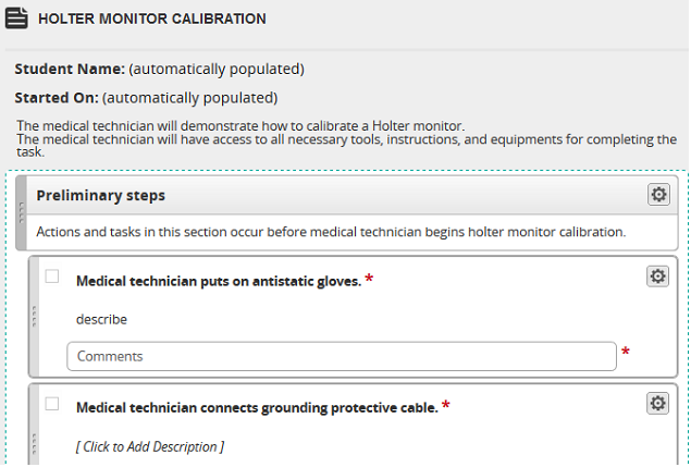
The Content panel (right panel) shows checklist content. The checklist title and description appear at the top followed by checklist elements.
Adding and arranging content
You add and arrange content by dragging and dropping elements. Find an element in the Checklist Builder panel, and drag it to the Content panel. After that, add text and make any necessary edits, and then arrange appropriately within the checklist.
Setting element properties (including making elements required)
You can set element properties, including making elements required, by clicking the options icon  and selecting Edit Properties.
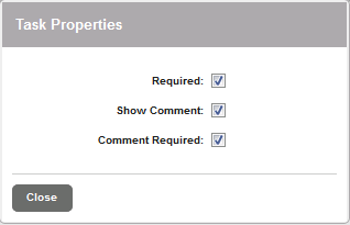
On the Task Properties pop-up, select options:
- Required: If this box is checked, an element must be completed before the checklist can be submitted. A required element is denoted by a red asterisk.
- Show comment: If this box is checked, comment box for the element appears on the checklist.
- Comment Required: If this box is checked, a comment must be entered for the element on the checklist before it can be submitted.