Analytics Summary dashboard
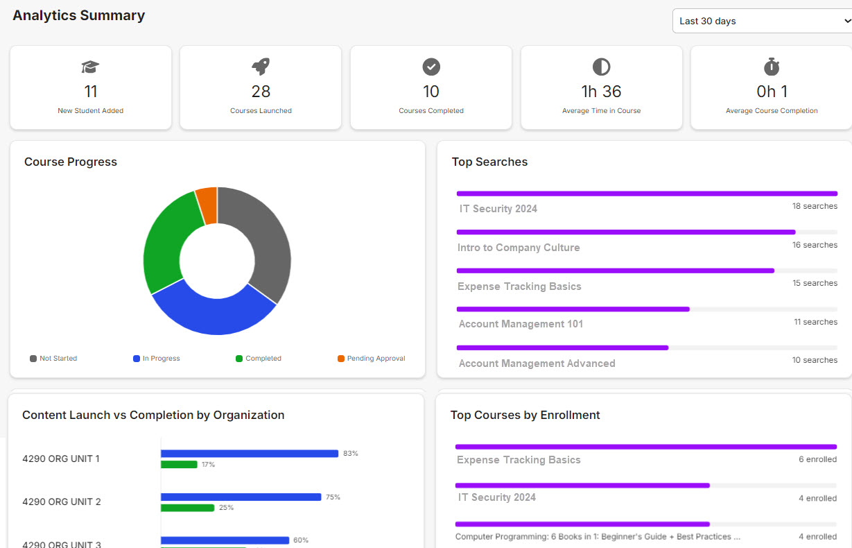
The Analytics Summary dashboard provides quick access to the information you need to transform data into action. Quickly assess learning capabilities within your organization without diving into detailed reports. Data is presented as tiles and charts for "at-a-glance" efficiency.
The dashboard is not available by default. Administrator users must be granted access.
Tiles and charts
Here's a summary of each tile and chart and what they do.
| Tile | Description | Filter |
|---|---|---|
| New Students Added | Shows a count of all new students in Rival Learn during the time period selected in the Days filter. | Last 30 days (default) Last 90 days Last year Year to date |
| Courses Launched | Shows a count of all courses launched during the time period selected in the Days filter. | |
| Courses Completed | Shows a count of all courses completed during the time period selected in the Days filter. | |
| Average Time in Course | Shows the average time in a course during the time period selected in the Days filter. | |
| Average Course Completion | Shows the average time it took students to complete courses during the time period selected in the Days filter. |
| Chart | Description | Filter |
|---|---|---|
| Course Progress | Shows student progress in courses. The donut chart shows progress based on status: Not Started, In Progress, Completed, and Pending Approval. | Last 30 days (default) Last 90 days Last year Year to date |
| Top Searches | Shows the courses that students most frequently search for. The bar chart shows course name and number of times it was searched for. | |
| Content Launch vs Completion by Organization | Shows the percentage of content launched vs completed, broken down by organization. Useful for ensuring that organizations within your company have successfully launched content. The bar chart shows launched content (blue) and completed content (green). | |
| Top Courses by Enrollment | Shows the top courses based on enrollment so you can identify your organization's most popular courses. The bar chart shows the course name and number of students enrolled. | |
| Top Courses by Completion | Shows the top courses by completion so you can identify which courses are quickest to complete. The bar chart shows course name and number of students who completed it. | |
| Top Incomplete Courses | Shows the top courses that are incomplete. The bar chart shows course name and number of students who have not completed it. |