Explore
Note: Explore is available based on your user profile's tier assignment.
Explore lets you look at a report's data in-depth and do cool things. From within Explore, you can create a report or customize a report to meet your needs, including adding and removing data points (dimensions), rearranging columns, selecting visualizations, and more.
Explore has two "flavors" and essentially does the same thing but the intent and starting point are different.
| Starting point | Use when you want to: | |
|---|---|---|
| Explore (dashboard) | From the navigation bar, click Reports & Analytics>Explore. | Build any report and dashboard that you want. Think of this as the new Report Builder. |
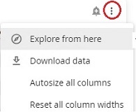
| Explore from here | From within any standard report, click a tile's ellipsis and then click Explore from here.
| Use an existing standard report and build off of it (customize). |
Regardless of the starting point, Explore has the same features:
- Filters
- Data points and dimensions
- Data grid
- Visualization
Filters
Filters appear above the visualization panel. The filters default to the values you selected on the standard report. You can change them if you want. 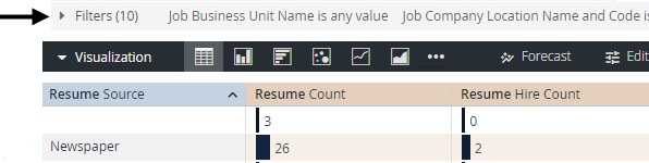
Click the arrow to expand the filters panel. You can make changes to the filters here:
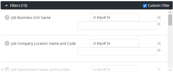
Note: Changing filters here affects the report and visualization in Explore. It does not change anything on the standard report.
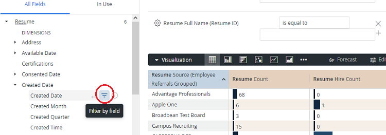
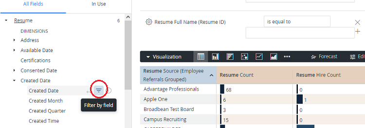
You can add additional filters. In the Data Points list for the filter you want to add, click  .
.
Data points and dimensions
Data points appear on the left side of the page.
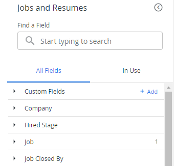
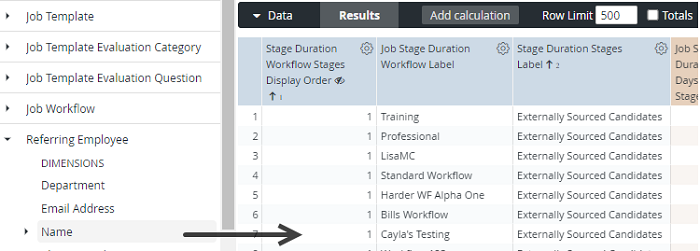
Data points have dimensions. A dimension is a set of unaggregated values that you can group data by. Click a dimension to add it to the report (data grid). By doing this, you are taking a standard report and customizing it. Add all the dimensions you want!
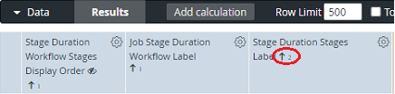
Remember you can sort columns. Click the arrows in the column heading to toggle from ascending to descending:
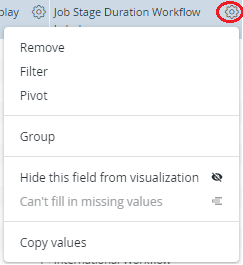
You can also do amazing things with the gear icon. Click it to see options:
Data grid
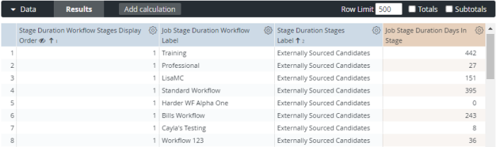
As you might expect, the data grid contains a report's data. It's the content you are looking for when you run a report. When you use filters and add/remove data points, the data grid changes. You can do also do some unique things like add calculations, limit the number of row, and included totals and subtotals. Work with these options to get the data the way you want it.
Visualizations
At the top of the page, you'll see the Visualization tile. In the menu bar, you can select various bars and graphs to present the data in different ways:
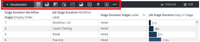
Some visualizations work better with certain reports. Click each visualization option to see what works best.